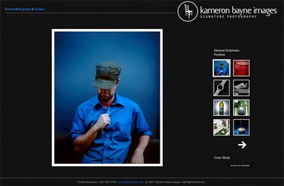
New KBI Website
Monday, May 21, 2007
For current students, the year is wrapping up... we only have a day or so until we hand in all of our hard work. On one hand, it's exhausting. But on the other, it the most exciting thing I've ever experienced -- especially to see everyone's amazing images together. It's quite an astonishing feat to see the quality of work compared to our previous level just 9 months ago!
Well, now I'm finished and am proud to present to you the product of my blood, sweat, and tears during the last few months at Hallmark: my new website!

posted by kameron @ 3:54 PM,
![]()
![]()
1 Comments:
- At May 21, 2007 4:28 PM, Timothy said...
-
Site looks good. Clean and simple. Less is always more in my book.
Two things if I may: The "simple viewer" button to download the software is right under your "forward button", almost touching it. My mouse slipped and it hit the download button. Not terrible but you don't want your viewers minds to wander.
Also, the chair logo? Didn't really understand it. Logo's, unless your a corporation, don't do it for me - especially if It takes me longer then 20 seconds to understand it.
Overall it looks good!

