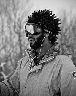
1 composite and 1 portrait
Tuesday, December 11, 2007


posted by Rob Cusick @ 8:39 AM,
![]()
![]()
2 Comments:
- At December 11, 2007 9:48 PM, Josh Bobb said...
-
I dig the composite. Both the dog and person need a drop shadow and cast shadow though to make it more believable. Michael Merritt or Tom Prutisto will show you how to do that later on in the year.
Good stuff. I've used those techniques quite a bit retouching for Banana Republic and Pottery Barn. - At December 12, 2007 5:59 AM, kbayne said...
-
I like the color treatment you've done with your composite.
I also really like your portrait - the snow is a nice touch and adds another dimension. However, the black 'n white print itself looks a little dull. In my opinion, it doesn't do justice to your subject; I'd consider adding some contrast and maybe a vignette to subtly draw the eye to the subject.
Just my two cents - keep posting! I definitely think you have the eye of a photographer.

