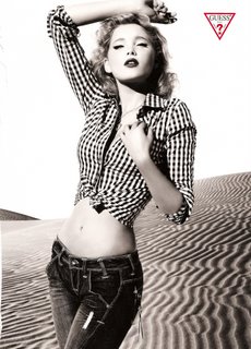
"Copying and Ad"
Wednesday, December 5, 2007

 ... but what do you think?
Labels: Ad, Commercial
posted by jessica toney photography @ 9:47 PM,
![]()
![]()
5 Comments:
- At December 5, 2007 10:27 PM, Aaron Potter said...
-
More makeup and less of a fill light. Great attempt and I love the shot! :-)
Too bad we all don't have cool sand dunes in our backyards. - At December 5, 2007 10:48 PM, jessica toney said...
-
There actually is no fill light. It's just 1 parabolic, and 1 back light. More makeup definately would have been better, and maybe some fake eyelashes! I think I will re-attempt this again later on.
- At December 5, 2007 11:18 PM, Faith Dugan Photography said...
-
Have her look down a little more to get the "sexy hooded eye" look.
- At December 5, 2007 11:20 PM, Faith Dugan Photography said...
-
And the mouth a bit separated. That will give her the more sexy look in the original ad, unless you were trying to cut back on the sexiness. Nice job recreating the light!!
- At June 17, 2008 6:52 AM, Sabrina. said...
-
I JUST ADORE THE GUESS AD PICTURE!!
But your friend isn't sexy enought.
It's about the semi-opened lips and the chinese yey make-up, with half-closed eyes, for an orgasmic look.
WHO'S THE GUESS MODEL, ANYONE KNOWS?
THANKS

