Promo Card
Tuesday, December 18, 2007


posted by Adam Fritz @ 8:59 PM,
![]()
![]()
5 Comments:
- At December 18, 2007 9:27 PM, Jason McGrew Photography said...
-
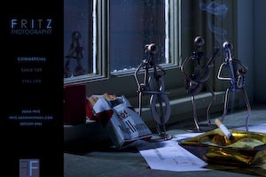
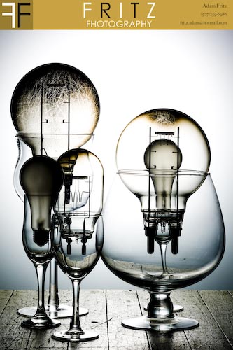
These look ok. The first one seems really dark. However it could be the mood you are trying to set. I personally would not use it for a promo. The second one is a lot better. It is a little cluttered but a much better image than then the first one.
keep at it. - At December 19, 2007 8:54 AM, William Long said...
-
Love your logo! Love the lighting in the second one! Continue to share!
- At December 19, 2007 8:58 AM, kbayne said...
-
Great glassware shot! I think Jason's right about the first one - you want your promo material to really "sell" your photography.
I think the second image really stands out, and I'd play more with the design to see if I could match the level of the image itself.
Thanks for posting! - At December 19, 2007 9:30 AM, Wayne Wallace said...
-
I agree the second one jumps off the page more.
Regardless of image quality these are the questions you need to answer before spending money on printing.
Who is your target audience?
What do you want them to do when they see this promo?
Can you measure it's success?
We photographers get so wrapped up in images we think they will do all of our selling -- they wont!
If you want to start learning how to sell to your audience head on over to www.photographymarketingsecrets.com - At February 18, 2008 11:07 PM, daniel meigs said...
-
cool.

