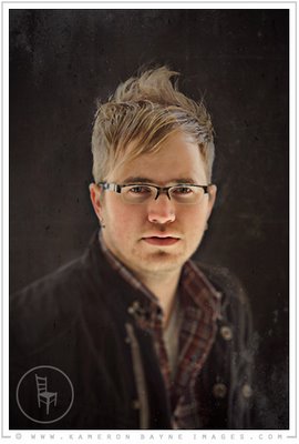
Tim Wildsmith
Saturday, March 8, 2008

We went for a daguerreotype inspired treatment for a couple promotional posters. You can check out his music on myspace and see more pictures on the blog.
Labels: Kameron Bayne Images, music, Tim Wildsmith
posted by kameron @ 6:09 AM,
![]()
![]()
4 Comments:
- At March 8, 2008 4:26 PM, shizon said...
-
Great photo Kameron. The composition and style mesh really well. Awesome!
- At March 12, 2008 7:18 AM, Patrick Collins said...
-
Nice work Kameron - great use of DOF and the post work gives it a great feel.
- At March 13, 2008 2:05 PM, Susan McManus said...
-
Yea, Kam, I really like this. What lighting did you use?
- At March 13, 2008 5:57 PM, KBISTUDIO.COM said...
-
Thank you, I really respect all of your work so everyone's compliments mean a lot to me.
The lighting is all natural - just a large black gobo/screen in front of a garage causing the edge light all around.


