A Couple Phase 1 Final Images
Thursday, November 6, 2008


posted by K. Dalton @ 8:16 PM,
![]()
![]()
2 Comments:
- At November 6, 2008 11:39 PM, Wayne Wallace said...
-
Kristi,
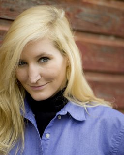
Your exposures look good.
I would prefer to see the opposite composition on both on each of them.
On the first, more room on the left and on the second more room on the right.
Watch for light in the eyes on these headshots, you have some shadow on the first one caused by the hair. On the second I think you could have positioned the subject to get more light in the eyes. The chain is a little distracting in the second one as well.
After a while you will automatically do these things without thinking about it. - At November 7, 2008 1:20 PM, Patrick Collins said...
-
Hi Kristi,
Congratulations on making it through phase 1 - good job! So, here's some feedback on your images.
As Wayne pointed out, both exposures look good. And in both cases, you've found locations that have a very nice quality of light - it's soft and suitable for the portrait. Also, you were able to get some good expression out of your subjects (which can be the hardest part sometimes).
Here are some things to think about...
First Image:
1) either raise yourself up higher (I usually have a step stool with me on portrait sessions) or lower your subject and get her to look up at you. This will help the hair fall away from her eyes instead of over them and it makes for a more interesting composition. Also, it looks like the eye that is closest to you is the dominant eye (ie: slightly larger - we are all asymmetrical in that way). I might have turned her so that the other (camera left) eye was the leading eye (closer to you). Or, I would have gone with the hair in the face thing and covered the other eye completely (which I frequently do in those cases).
2) Your subject is broad lit here - which isn't a big deal, but by turning her head a bit to camera right and moving yourself a bit to the left, you would get the short light position. You may not have covered short/broad light yet - so don't get too hung up on this.
3) Although the light is very soft, you might try a silver or white reflector held just out of the shot to pop a little light into her eyes. A nice catch light in the eyes can make a big difference in the impact of the final image.
4) On a more subjective note - I think you could strengthen the composition by either moving in closer (and going for a more dramatic portrayal of her eyes) or pulling back to avoid cropping the camera left side of her head.
Second Image:
1) My comments about the positioning/lighting would be much the same as the first image. You've found a location that has a nice soft light - play with it a bit. Your subject has darker eyes, so use something to bounce some light up into them.
2) As for the crop - it's something you have to work on developing a "feel" for. My suggestion here is to be mechanical about it at first - after you take the shot that you like, (keep the zoom constant) move in a foot closer then another foot closer, then a foot farther away, two feet farther away, etc. This will give you options later and will help you figure out what works and what doesn't.
In both images, your backgrounds have a nice graphic quality to them - in this case, repeating horizontal and vertical lines. Now, you need to take advantage of those features to strengthen your compositions. In the first image, as Wayne suggested, have the horizontal lines leading into her. And in the second image, by just titling the camera a bit you would have created a more dynamic feel (especially if you had opted for a higher POV).
It seems like a lot of stuff to think about - and it is! But it does get easier as you progress. So, keep up the good work and best of luck to you!

