Breaking Up Lines:

posted by Heaven Leigh Photography @ 8:10 PM,
![]()
![]()
6 Comments:
- At November 6, 2008 9:35 PM, jessica toney photography said...
-
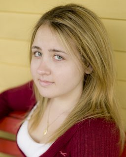
hey.. I know that house it's 11 Bridge St! I have my warm on warm there!
- At November 7, 2008 12:30 AM, Wayne Wallace said...
-
Hi Alyssa
Thanks for posting.
Your exposures look good.
I like your self portrait but it's seems kind of basic, we had some really creative ones in our class you can see the one I did at school here
http://gallery.mac.com/wallacephotobiz/100451/me-201/web.jpg
Actually the next 3 seem kind of safe, it looks like you have your exposure under control and you met the minimum of the assignment start pushing yourself and getting more creative in the concept, the assignments are not restrictive and give you lots of freedom for interpretation, you'll have plenty of time for safe shots later when you have clients, now is the time to stretch yourself the last one is a little tight and off center for me.
See my vertical line assignment shot here
http://gallery.mac.com/wallacephotobiz/100435/05292008161/web.jpg
On your product shot I would not use such a wide open aperture, I want to see some detail in the background. Also, where do most people wash their face? The tub or the sink?
Keep up the good work and keep posting so we can see your progress. - At November 7, 2008 2:31 PM, Patrick Collins said...
-
Hi Alyssa,
Congrats on making it through phase I! One down, three to go! So, here's my two cents on your work...
I think the lighting is beautiful on your self portrait - really nice job with that. And I like the crop, the head tilt and the earrings too! But I do agree with Wayne when it comes to the creativity element. It doesn't have to be over the top or outrageous (as that may not be you) - but it should have a message or some intent. My question would be: "What does this image tell me about who you are?" It's a very nice picture - but you could definitely explore this further (IMO - some of the best self portraits show us something about the subject that we don't always see).
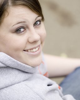
As for the rest of your portraits - I think the thing that jumped out at me first was that they all looked very similar. I probably would have opted for different backgrounds - but let's say that you had no choice and you had to use the one location.
Almost all of the images have the same POV - they look like you were basically standing in the same spot. It does look like you got a slightly higher POV for the last two, but still - they look too similar. So, move around. Put your subject in the far left side of the frame, the far right side of the frame, at the top, in the bottom. Get further away and use negative space - come in super close and fill the frame. Tilt the camera, shoot from down low, don't always show the subject's face (ie: blue jeans against the yellow siding, or close in on your subject in the red sweater holding a red rose). Take some risks.
If you look at the portraits you posted here, you start to see a pattern. Break up the pattern - it makes the body of work more interesting.
I like the product shot (although I agree with Wayne - I think a sink might have been a better location). But the use of the shallow DOF is very effective and the tones of the setting work really well for the product. I probably would have either kept the product dry or really spritzed it up more. I think your POV is good here too - I probably would have also tried tilting the camera a little just to see if it would add some additional visual interest.
Wayne is absolutely right about using this time to really push yourself - we need to see more about who you are in your images.
Alyssa - please don't get discouraged by anyone's feedback. I do the same thing to myself after a shoot - and there are always things I think I could have done differently - better. My "fix" is to focus on a personal project - usually something simple - and just play. Do things you wouldn't normally do - the idea is to forget about all the "rules" and just be creative. Sometimes I get good stuff, sometimes not. The theory is that if I do manage to pull out something interesting, maybe I can incorporate it into my next shoot.
I look forward to seeing more of your work on Hipsters! Good luck! - At November 10, 2008 7:56 AM, Alyssa Archibald-Reed said...
-
Thank you all for the advice, I'm absolutely sure it will come to great use as the year goes by =)
Haha yes, it is 11 Bridge St. lol
-Alyssa - At November 10, 2008 8:56 AM, Wayne Wallace said...
-
Be sure to use the chat forum for feedback as you work on projects, it's a more private forum and better suited to having on gong conversations.
I'm a Bridge 11 alumni, I had the front bottom room! - At November 10, 2008 9:22 AM, Alyssa Archibald-Reed said...
-
the one on the front porch? lol
that's too funny that's my room haha =)


