Henri & Odette - Downtown Las Vegas Art Gallery
Sunday, December 21, 2008
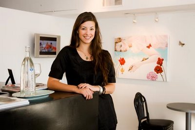
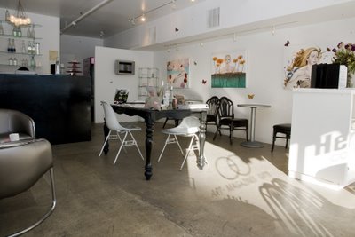
Henri & Odette opened in August of 2008 by Jennifer Harrington, the Henri & Odette gallery brings a sense of Europe to Downtown Las Vegas. The aim of the gallery is to promote culture and academic art while providing a place for artists, writers, and Downtown locals who want a different place in the to gather, discuss, read, and live. The gallery offers a sense of welcome to any outsider with its water bar, community events, coffee, international magazines, and art books.


Labels: Editorial Photography, Fremont Street Las Vegas, Las Vegas Art Gallery, Wayne Wallace Photography
posted by Wallace Advertising @ 8:32 PM,
![]()
![]()
3 Comments:
- At December 22, 2008 6:35 AM, said...
-
The first one is good, the leading lines go to her face, she has a nice smile, the chair pulled back from the table looks a bit weird, but over all looks good.
The second one on the other hand looks like a snapshot, no sense of lighting and the light coming from the window is kind of interesting, but way to distracting fore this shot. - At December 22, 2008 9:49 AM, Mark Denman said...
-
Wayne,
Its hard offering critique to someone whose done this longer than I but I wanted to offer my thoughts. In the second shot there is a lot of problem solving to be done. The space doesn't look that large so there probably weren't too many great places to shoot from.
These are my "suggestions". The light coming from the window is a bit distracting. I might have picked a different time during the day for that shot or found something to flag that light coming from the window.
The perspective is kind of low to me also. A higher perspective would give a better sense of the entire space (having said that it doesn't look like there's much more to see.) which moves me into staging the scene.
From a staging standpoint I would have removed the two white chairs and replaced it with one black chair. Pull the chair in the foreground out of the picture. Also, the flowers and the black thing to the right is blocking the art work on the wall. Those could have been removed. If they would have allowed, I would have placed one table and chair set under the center art piece and one table and chair set under the TV and removed the glass shelving thingy (this is just me. Some others might disagree with my arrangement of the space). From a higher perspective this would have given the space more balance. Also I would have removed some of the stuff from the center table as well as the counter. It looks like clutter.
I was thinking that a night time shot with the track lighting might be interesting here also, but if the gallery does not operate in evening hours then photographing it in the light in which most patrons will view it is probably best. It just becomes necessary to pick the right time of day to do the shoot.
Just my thoughts. Concision is a problem for me sometimes :) - At December 22, 2008 12:56 PM, Wayne Wallace said...
-
Thanks Mark,
This was just part of a much larger editorial gig where I had to photograph many establishments in a short window of time, drive by and get what you can fashion.


