Pimp my Pic
Friday, January 16, 2009
Okay,
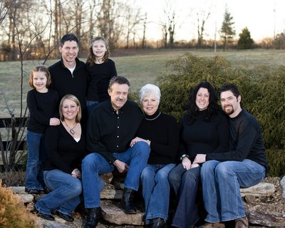
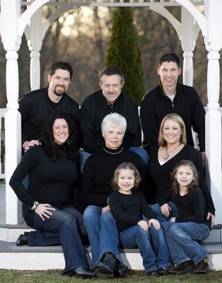
I'm not afraid of a little criticism. It's how I learn and grow. So I'm posting these images of a family session I did recently. I recall my first family session I did as a student ( 8 people ) It was a disaster (posing wise) I have not posed as large a family since that time. So when the Petersen family approached me and asked me to photograph their family of 8, shades of the Deerfield 8 popped into my mind. Since we were taught never say no to a gig, I did it.
I'm asking you to critique the posing of these two images. If you have tips on how you pose large groups I'm gamed. If I'm way off, let's hear it. Or if you just see a little tweak here and there let me know. I'm getting more requests for family portraits so if there are things you can share that would be helpful, please share. (Critique not limited to posing.)


Visit the Nashville Family Photographer's website for more images.
posted by Mark Denman @ 1:07 AM,
![]()
![]()
11 Comments:
- At January 16, 2009 3:29 AM, said...
-
Looks like Barnes did this! Create your own style! Don't be a copy cat!
- At January 16, 2009 7:09 AM, said...
-
I also have a hard time to pose large groups too....i remember being told to group people in triangles...
- At January 16, 2009 7:56 AM, said...
-
Thanks for sharing. My thoughts are...
Photo 1 - you want to be careful not to crop off limbs (see their feet) unless it's more intentional than that. And it feels too heavy to the left with the grouping - maybe next time try putting the girls in the middle above or below to create more of a triangular group.
Photo 2 - you did a great job framing the photo with the gazebo - a very simple and striking background against their outfits. My suggestion on this one is to vary the heights of their heads more, than having them be straight across - do this by having some standing and leaning against the poles of the gazebo, some sitting, maybe the girls in the middle adding another dimension of height.
But having said all that, you did a great job making each family member look good on their own - and I am sure they will be happy having these keepsakes.
Thanks again for sharing and looking for open feedback. - At January 16, 2009 9:02 AM, said...
-
the 1st picture you have alot of headroom but yet decided to cut their feet off and the hands are all over the place place for me..groups are tough, i just did a 30 person group and that was a challenge.
The 2nd pict legs positions are all over as well and the hand on the shoulder on the left side. - At January 16, 2009 9:52 AM, Mark Denman said...
-
To Anon #3,
Thanks for the input. I'm curious, with a group of 30 how did you organize the hands and legs? Was there some uniformity with all 30? And as for the first image in my post what would your suggestion be on how to pose the hands (as you see them) and the legs. I did notice that about the cut off feet, however.
Thanks. - At January 16, 2009 10:53 PM, Joshua Kelly said...
-
Constructive criticism...well here's what I would say cut down on the head room move the kids forward...adults like to see kids and adults are more self critical. There seems to be little depth on the top shot and work on the balance of the photo it's weighted heavy to the left. As for the bottom shot it's very linear and almost cubic in the posing...work on triangles as others have said...they cause your eye to go to the faces and wander in a pleasing way...Triangles are also very strong shapes. Avoid people growing out of people or objects growing out of people (merging). Also if you have a person who is larger look for the best angle to put them at that is most pleasing to the eye, and create depth to the shot by layering people...a person who is larger will always be more at ease if you layer in front of them this also reduces their size in the image by bringing others forward...a good photographer can easily add or subtract 25 pounds from or to a person...this can make the difference between them loving the images or not. Expression sells...try to get the candid moment not the cheese. I highly recommend that you assist at a wedding or two with someone who has been doing it awhile. Experienced wedding photographers are really good posers so you should be able to pick up a lot about balance in a photo and user of layering. You only get one shot to make it right in weddings...there are no do overs.
Keep working on your posing and keep posting it will be fun to see your progression. Don't ever be afraid to try something once but if it's not working don't force it...it's better to change it when you know it's not working for you or your subject then to push a less then perfect pose. - At January 17, 2009 4:19 AM, Sharon Rieck Photography said...
-
Mark, Here's my two cents... with larger family groups, I used to cut in too close (similar to what I see in your pictures) but have finally figured out to give them space. Everyone tends to feel and look more comfortable if they have some wiggle room between them. I'm not sure what your location situation was but try and give your groups a little more space in between people. That makes it easier to create the triangles with the heads, that make large groups more pleasing.
Also, I can see that you are trying to keep the family with children together. I always try to do that first, but sometimes it's impossible to create a pleasing composition. If it's not working by keeping families together, try putting the kids down on the ground in front of the rest of the family. PLus by doing that it adds more depth to the image.
Otherwise, you've accomplished the hardest part, organizing the clothing choices. They all look great! - At January 19, 2009 6:05 AM, said...
-
HEY WAYNE. I posted a comment here as anonymous and you didnt post it - are you really editing these? i thought my post was very constructive and encouraging. I am not going to post if I know someone is really going to "choose" what makes it and what doesnt. That's discouraging.
- At January 19, 2009 8:07 AM, Wayne Wallace said...
-
Hey Anon,
No, I didn't censor your post - At January 21, 2009 5:15 AM, Mark Denman said...
-
Everyone,
Thanks so much for your critques and suggestions on the images I posted. They were all very helpful. Thanks for taking a minute to post. More than you know I appreciate it. This is what makes this community valuable. - At January 23, 2009 7:06 AM, Wayne Wallace said...
-
Hey Mark,
I know the blog gets more attention but you should consider using the forum for critiques.
Your call, thanks for posting.


